SWEATING THE DETAIL 2: more micro-tricks for making smaller homes work.
Reducing building size is one of our most potent decarbonisation strategies. We backgrounded this in “Size matters”, where we also outlined how our average stand-alone houses have carbon footprints many times more than aligns with the Paris Agreement.
Here are a few more micro-tricks drawn from experience working over the years with literally thousands of building designs.
And just to recap, this isn’t a “design guide”, but just explores sometimes-overlooked features that can affect the size of our buildings.
Core message: Be honest about what is driving design decisions, and double check that they still align with the real design intent.
SLOIP: “Space left over in planning” is not as uncommon as you’d think, and it often happens where lack of design refinement has left small corners or dead ends that add little to the building (except carbon and cost).
It’s a handy trick for a designer to label SLOIP “feature sculpture” (or, in pre-mobile days, “phone shelf”) or some such, but unless that’s actually what the owners want, let’s stop kidding ourselves. Having said that, the rest of a plan may be so good that a little SLOIP is a small price to pay. Just be sure it really is worth it.
Here’s part of the plan we saw in “Sweating the Detail 1”, with two areas of SLOIP shown.
Floor Plan Showing SLOIP
Building spaces we don’t really use: Time to fess up. For as long as I can remember, I’ve known that lots of houses have front doors and porches that people hardly use, and garages that never see a car. And yet with my latest house I designed in both of those features. Sure there are “reasons” I included them, but the reality is I’ve ended up with a house where everyone but strangers come in through a side door on the deck, and my car parks outside while the garage shelters heaps of stuff I could well do without. Sound familiar?
One positive step, though, in getting rid of space we don’t really need is shown in the plan above, with the laundry tucked into the back of the garage. Thankfully it’s now much less common to build an entire room just to accommodate a broom, a washing machine and drier!
When smaller things seem bigger: Shopfitters and bathroom designers are brilliant at using lighting, mirrors and the like to make spaces seem much bigger than they really are.
There are a few other design tricks we can use too.
We likely all know that light colours seem to expand a space and dark colours draw it in. And a little 3-D thinking about furniture heights quickly shows we don’t need a full corridor width beside a bed because the bed only comes up to knee height.
And here’s a window that feels a lot bigger than it really is. It’s the main window in my bedroom, it’s entirely adequate, and it’s only 1200 mm wide. I’ve taken advantage of the deep experimental walls to splay the window reveals, and this brings lots of benefits. As well as giving a generous appearance, the splay allows light to spread more widely through the room, it lets me enjoy the outlook from more places within the room, and you can see the lovely way the angled reveals graduate the light.
Okay, not everyone has such thick walls, but the principle still applies, and standard walls are tending to get thicker, with bigger studs, and framed cavities inside and out. Also, with thermal codes often limiting total window areas, making small windows seem bigger has a lot going for it.
The kitchen conundrum: We should have a good long think about what we expect of kitchens, and how we design them. Not only are they the heart of many homes but they are also one of the costliest parts, and have a carbon footprint to match. No matter that the world is brimming with gleaming new “better-than-ever” appliances and gadgets, I’m campaigning for us taking a leaf out of Nate Hagens “Great Simplification” book, and to take stock of how many of those we really need.
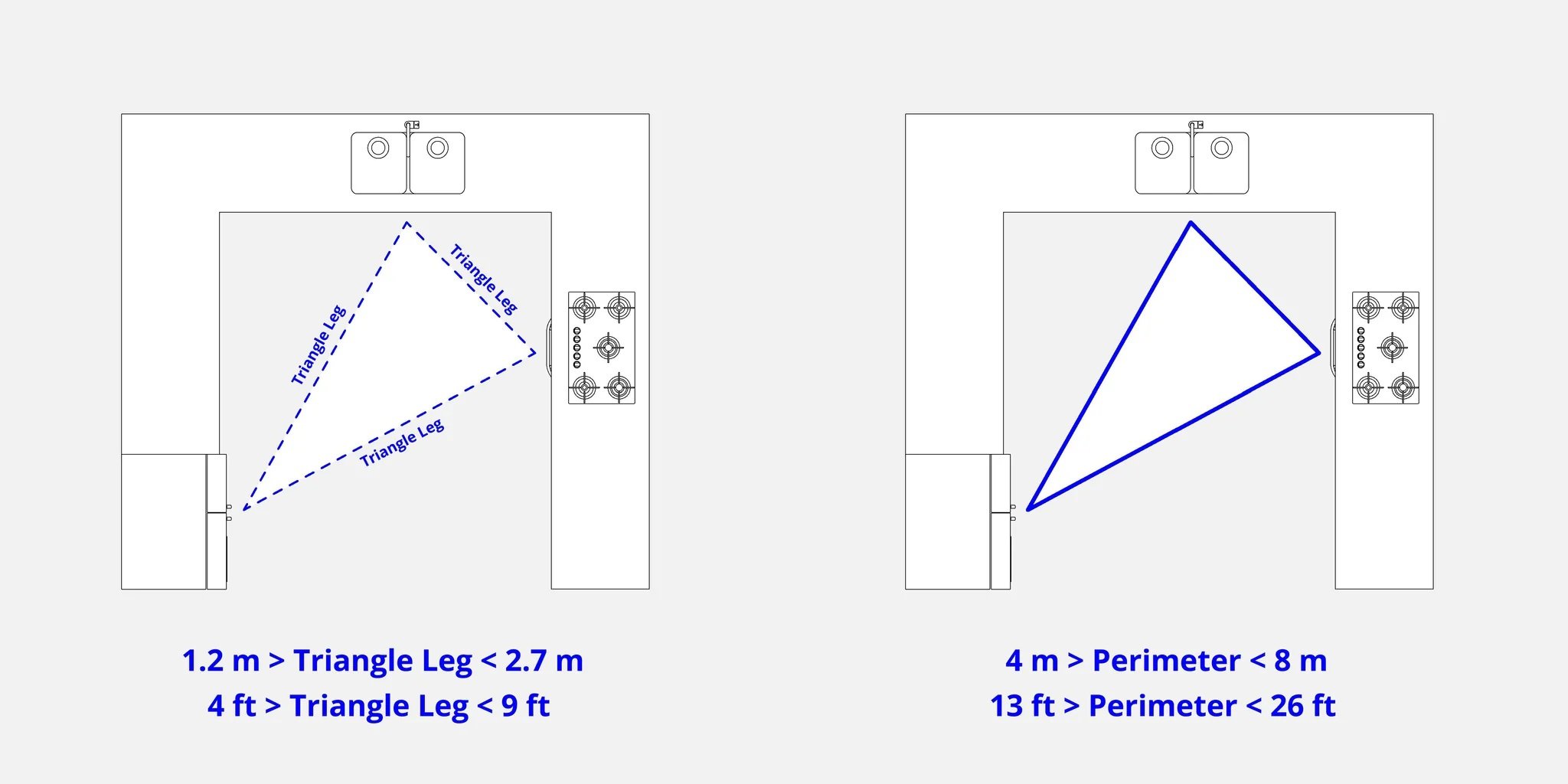
And no matter how much the famous “kitchen triangle” has been stretched or reshaped over the years, in a quest for making things both small and workable we should keep that triangle front and centre in our planning.
For all the advances in kitchen design and fittings, kitchens now often have even more SLOIP than they used to. One of the culprits is the 600 mm deep standard cabinet, sized not for what we want to store in a cupboard or drawer, but so the bench will fit a cooktop or oven or dishwasher.
We all know the backs of those 600 mm deep cupboards are a pain – often hard to see into, let alone actually get stuff in and out of. So I’m a fan of reintroducing the old fashioned 450 mm deep range of cabinets to use where we just want to store stuff. Then, of course, the kitchen might well end up 150mm narrower, gifting that space to another room, or even sometimes enabling the entire building to be 150 mm shorter or narrower (with a shorter or narrower carbon footprint to match!).
And we haven’t even touched on “do we really need a dishwasher?” Oh sacrilege!
If you got something out of these micro-tricks, you might like “Sweating the Detail 3”, which will include a further look at doors and windows, a bit of gushing about plumbing, and “we should spend more time on the stairs”.


